Radiobutton
UI element for representing multiple choices
 |
Development guideline
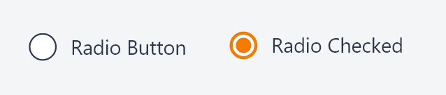
Example of a typical radio button:
<label class="k-radio-label">
    <input type="radio"
           rb-validate
           metadata-model="vm.itemPriceAgreement.extractDiscount"
           ng-model="vm.itemPriceAgreement.extractDiscount"
           ng-value="true" />
    {{'Extract/separate discount from gross price' | translate}}
</label>

<label class="k-radio-label">
    <input type="radio"
           rb-validate
           metadata-model="vm.itemPriceAgreement.extractDiscount"
           ng-model="vm.itemPriceAgreement.extractDiscount"
           ng-value="false">
    {{'Include discount in gross price' | translate}}
</label>
Attributes
label: Label to show above the fields. Ex. "{{'Quantity' | translate}}"
ng-model: The value of the element. AngularJS takes care of two-way binding between the HTML view and javascript model.
ng-disabled: Makes the field disabled
ng-blur: Event triggered when blurring (leaving) the field
no-validate: Do not apply metadata to the field. Default "false"
metadata-model: Apply metadata from another field. Example 1: "vm.model.customerId". Exampel 2: "{{vm.metadatamodel}}". If you use a binding like this you must remember to set an initial value for vm.metadatamodel in the controller.
class: CSS class to apply to the whole UI element (label and field)
cssclass: CSS class to apply to only the field (and not the label)
rb-inspect: Add inspect link next to label. When clicking the link, the users will be redirected to the provided value.
rb-focus: Set focus to the input field when given value evaluates to true
rb-fieldname: Makes the element customizable in edit mode (reorder and hide/show fields). This value will be the name of the fieldname in edit mode.
readonly: Makes the field readonly (Not overriden by metadata)
fieldsize: If no flex parent is present, use with bootstrap grid system (12/12)
labelsize: If no flex parent is present, use with bootstrap grid system (12/12)
custom-validate : Evaluate expression and returns a validation message. Ex. "vm.validate" where vm.validate is a function which returns a string value that is displayed as a tooltip if the validation fails.
access-doc: Defines which document to use for the access-rule-, or api-operation-attributes. Ex. access-doc="COA/{orderId}"
access-rule: Access rule (ARU) for enabling/disabling the button. Ex. access-rule="100143"
api-operation: API operation (AOP) for enabling/disabling the button. Ex. api-operation="100144"
operation-url: API url to use as base for the API operation request. Ex. operation-url="sales/orders/{orderId}"
access-display-state: The value "hidden" if element should be hidden instead of disabled when no access.
Design guideline
Use radio buttons when you want users to see all available options and the list of options is small. For mutually exclusive options, consider a checkbox.
Tip
Radio buttons are best for six or fewer options. For more than six options, consider a select box, which prompts users to disclose the options.