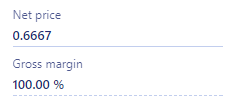
Number field
UI element for presenting numbers

Development guideline
Example of a typical number field:
<rb-input type="number"
          ng-model="vm.model.gm"
          label="{{'Gross margin' | translate}}"
          rb-fieldname="gm">
</rb-input>
Attributes
type: Always "number".
format: How to format the number. See section below.
decimals: Number of decimal points Ex: "2" => 10.00
min-decimals : Number of decimal points. Will not work when decimals-attribute is set. Ex: min-decimals="2" converts "10" to "10.00", but "1,123456" remains "1,123456" (does not reduce decimals in).
spinner: Add controls to increase/decrease the value. "false" by default
min: Minimum value
max: Maximum value
label: Label to show above the fields. Ex. "{{'Quantity' | translate}}"
ng-model: The value of the element. AngularJS takes care of two-way binding between the HTML view and javascript model.
ng-disabled: Makes the field disabled
ng-blur: Event triggered when blurring (leaving) the field
no-validate: Do not apply metadata to the field. Default "false"
metadata-model: Apply metadata from another field. Example 1: "vm.model.customerId". Exampel 2: "{{vm.metadatamodel}}". If you use a binding like this you must remember to set an initial value for vm.metadatamodel in the controller.
class: CSS class to apply to the whole UI element (label and field)
cssclass: CSS class to apply to the only the field (and not the label)
rb-inspect: Add inspect link next to label. When clicking the link, the users will be redirected to the provided value.
rb-focus: Set focus to the input field when given value evaluates to true
rb-fieldname: Makes the element customizable in edit mode (reorder and hide/show fields). This value will be the name of the fieldname in edit mode.
readonly: Makes the field readonly (Not overriden by metadata)
fieldsize: If no flex parent is present, use with bootstrap grid system (12/12)
labelsize: If no flex parent is present, use with bootstrap grid system (12/12)
custom-validate : Evaluate expression and returns a validation message. Ex. "vm.validate" where vm.validate is a function which returns a string value that is displayed as a tooltip if the validation fails.
access-doc: Defines which document to use for the access-rule-, or api-operation-attributes. Ex. access-doc="COA/{orderId}"
access-rule: Access rule (ARU) for enabling/disabling the button. Ex. access-rule="100143"
api-operation: API operation (AOP) for enabling/disabling the button. Ex. api-operation="100144"
operation-url: API url to use as base for the API operation request. Ex. operation-url="sales/orders/{orderId}"
access-display-state: The value "hidden" if element should be hidden instead of disabled when no access.
Format
For Numbers
Use "nx", where x is number of decimal points.Ex: format="n0" => 10
For Percentages
Use "px", where x is number of decimal points.Ex: format="p4" => 10.0000%
For label suffixes
Use "# {{model.unitProperty}}" without vm values.Ex (where model.unit = 'pcs'): format="# {{model.unit}}" => 10 pcs
Design guideline
Avoid using the spinner unless the user only should increase/decrease by a few numbers.
When a number field represents prices, always use 2 decimals. Currency should be presented in the label.
When a number field represents percent, always use format "px".
When a number field represents quantity, try to add unit if possible.