Popover window
UI element for presenting popover window
Development guideline
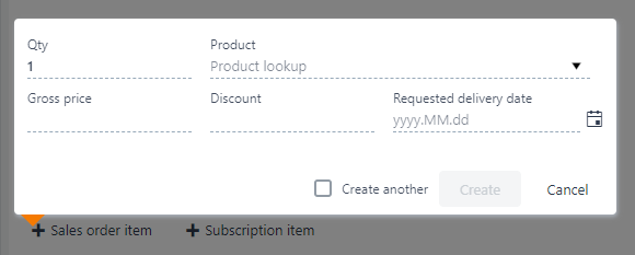
Example of a typical popover:
<script type="text/ng-template" id="popoverCreateTask">
    <div class="row itempopover rb-input-form">
        <div class="flex">
            <rb-input type="text"
                      class="tasktitle"
                      ng-model="vm.title"
                      label="{{'Title' | translate}}">
            </rb-input>
        </div>
    </div>
</script>

<i class="icon-plus"
   rb-popover=""
   ns-popover-template="popoverCreateTask"
   ns-popover-placement="top|left"
   ns-background-faded="0.5"
   ok-action="vm.create()"
   cancel-action="vm.clear()"
   disable-ok-action="!vm.title"
   ns-popover-on-open="vm.onAddExistingOpen()"
   create-multiple="true"
   create-multiple-model="vm.createAnother">
</i>
Attributes
ns-popover-placement: Placement of the popover (top/bottom | left/right)
ns-background-faded: Background fade level. Value between 0 and 1.
ns-popover-template: Reference to the script template that will be displayed inside the popover
ok-action: Ok button with click event
cancel-action: Close button with click event
disable-ok-action: Disables the ok button if the value if true
create-multiple: Display a "create another" checkbox, which if checked prevents closing the popover after clicking the ok button
create-multiple-model: Value to set the checkbox state
attr-component: Name of the component that will be displayed inside the popover. See seperate section about popover using component template
attr-params: The parameters that will be send to the component. See seperate section about popover using component template
Popover using component template
<i class="icon-plus"
   ns-popover-placement="bottom|left"
   rb-popover=""
   component="customerlookup"
   params="vm.params">
</i>

// In viewmodel
vm.params = {
    customerlistUrl:"sales/customers?$filter=Status eq 4", //In parameter
    customerSelected: function(item) { //Callback function
    }
};
Design guideline
A popover must come with / be paired with a triggering button
Pressing the escape key should close the popover
Pressing the close button should close the popover
It should be possible to activate the popover from keyboard only
All content and functionality of the popover should be accessible from keyboard only
User focus should be placed back on the triggering button when the popover is closed.