Grid
Grid is an enhanced version of an HTML table and are used to display tabular data.
Development guideline
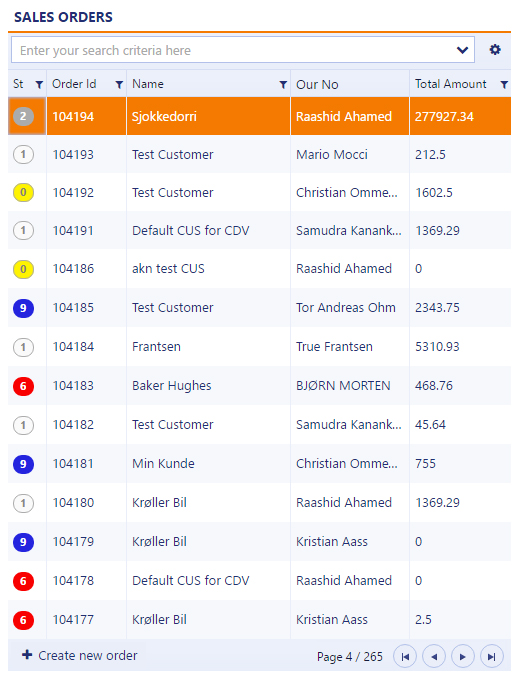
Example of a typical grid component
<div rb-grid
     access-rule="100474"
     k-data-source="vm.dataSource"
     lookupcomponents='{"Assignee": {"name": "EmployeeLookup"},
                        "ShippingServiceId": {"name": "ShippingServiceLookup", "params": "vm.shippingServiceParams"}}'
     k-on-change="vm.onChange(kendoEvent)"
     k-on-data-bound="vm.databound(kendoEvent)"
     k-reorderable="true"
     k-resizable="true"
     default-filter="Name,PurchaseQuoteRequestId"
     rb-message-field="highlightedNotification.translatedMessage"
     data-selectrow="quoteRequestId"
     rb-addnewlabel="{{'Create new quote request' | translate}}"
     rb-addnewpopover='{"popovertemplate": "newQuotePopover",
                        "okaction": "vm.createNew()",
                        "cancelaction": "vm.clearFields()",
                        "disableokaction": "vm.checkIfEmpty()"}'
     k-columns='[
	{
			"field": "status",
			"title": "St"|translate,
			"width": 33
	},
	{
			"field": "purchaseQuoteRequestId",
			"title": "Id"|translate,
			"width": 60
	},
	{
			"field": "createdAt",
			"title":"Created at"|translate,
			"hidden":true,
			"type":"datetime",
			"width": 45
	},
	{
			"field": "registrationDate",
			"title":"Registration date"|translate,
			"type":"date",
			"width": 110
	},
	{
			"field": "supplier.supplierId",
			"title": "Supplier id"|translate,
			"hidden": true,
			"width": 75,
			"lookupComponent": "SupplierLookup"
	},
	{
			"field": "validity.expirationDate",
			"title": "Expiration date"|translate,
			"width": 110,
			"hidden": true
	},
	{
			"field": "totals.totalAmount",
			"type": "decimal",
			"format": "{0:n2}",
			"width": 90,
			"attributes": {
					"style": "text-align: right"
			},
			"headerAttributes": {
                "style": "text-align: right"
            },
			"title": "Total amount"|translate
	}]'>
</div>
Attributes
k-columns: Grid columns. See separate section below.
k-data-source: Data source of the items. See separate section below.
k-on-change: Event triggered when selection change. See separate section below.
k-reorderable: Allows the columns to be reordered by the user. Ex. "true"
k-resizable: Allows the columns to be resized. Ex. "true"
k-row-height: Changes the row height. Default value is 37. Ex. "44"
k-toolbar: The value "false" removes the filter search and settings area. Default value is "true"
k-auto-bind: The value "false" prevents reading of data until a read()-call is made in the viewmodel.
k-on-data-bound: This event is called when data are applied and bound to the grid.
rb-multiselect: Turns on multiselect in the grid. Will only work in the first grid-component of the application. Typically the grid to the left. Ex. rb-multiselect="orderId,itemId"
rb-message-field: Ex. "highlightedNotification.translatedMessage"
rb-addnewlabel: The create new item button label to show in the bottom left corner of the grid. Ex. "{{'Create new quote request' | translate}}"
rb-addnewcomponent: Specifies component to use as create new popover. See separate section below.
rb-addnewparams: Specifies parameters to use together with the rb-addnewcomponent-attribute. See separate section below.
rb-addnewpopover: Template for create new popover. See separate section below.
paging-info-style: The value "records" changes the paging info to display record count instead of the default page count.
predefined-filter: Applies a filter box to the grid. See separate section below.
access-rule: Access rule (ARU) for enabling/disabling the create new item button. See separate section below.
access-doc: Defines which document to use for the access-rule-attribute. See separate section below.
default-filter: Filterfields to use when searching. Should always be specified! This simplifies the filter usage. Ex. value: "Name,FirstName". If the user types John in the search area it will end with this syntax: Name Contains "John" Or FirstName Contains "John".
lookupcomponents: Specify lookup-components for filterable fields. See separate section below.
data-selectrow: Makes sure the last selected row is remembered when the user returns to the application after a navigation event, or after a reload/refresh of the application. It works by finding the item ID in the grid which matches the url parameter.In the example below orderId needs to be defined as a parameter in the config file. Example value: "quoteRequestId"
Grid columns
Which columns to show is typical defined in a declarative column definition, but the columns can also be defined in javascript by using an angular binding like this: k-columns="{{vm.myColumns}}". The valid attributes is:
Field: The value field you want to display from the dataset
Title: Column header title. Specify translate to mark this as a translateable label.
Width: Fixed width in pixels. If not specified the field will get auto width which allows it to grow and shrink in size.
Hidden: Boolean value which tells whether the field should be hidden or visible by default.
Template: Use a template if you need a more complex html structure. Bindings are specified by the #=FIELDNAME# syntax, or by using dataItem.FIELDNAME
Type: Datatype. Supported types are: decimal, date, datetime, icon. Default value is string.
Lookup-component: If the end user types CustomerId = in the search area,- a selection named Lookup CustomerId appears. This will open a popup list where they can search on additional customer data to find the preferred CustomerId.
Format: Used together with type decimal. In the example totalAmount is of type number with 2 decimal points.
Attributes/headerAttributes: Used for styling the header and field cells.
ExportField: Used in cases where two fields is combined in one column, but where both fields must be able to be exported to excel.
Example:
<div rb-grid
     k-columns='[
     {
        "field" : "status" ,
        "title" :"St"|translate,
        "width" : 35
     },
     {
        "field" : "salesOrderId" ,
        "title" :"Order id"|translate,
        "hidden" :true
     },
     {
        "template" :"<div><i rb-inspect=\"#=sarlink#\" class=\"icon-sar\" title=\"Assignments\"></i></div>",
                "title":"Assignments",
                "type":"icon"
     },
     {
        "field": "registrationDate",
        "title":"Registration date"|translate,
        "type":"date"
    },
    {
        "field": "customer.customerId",
        "title":"Customer id"|translate,
        "lookupComponent": "CustomerLookup"
    },
    {
        "title":"Seller"|translate,
        "exportField": "seller.firstName, seller.lastName",
        "template": "#: seller.firstName# #: seller.lastName #",
        "hidden": true
    },

    {
        "field": "totals.totalAmount",
        "title":"Total amount"|translate,
        "type": "decimal",
        "format":"{0:n2}",
        "attributes": {
            "style": "text-align: right"
        },
        "headerAttributes": {
            "style": "text-align: right"
        }
    }
    ]'>
</div>
Datasource
Examples of datasource definitions. In the simplest form all you need to specify is an url. CreateKendoDatasource immediately executes a GET request on the specifyed API resource when the component has loaded. Use k-auto-bind="false" if you want to prevent that behaviour.
<div rb-grid
     k-data-source="vm.dataSource">
</div>
vm.dataSource = ds.CreateKendoDatasource({
url: config.dataSources.orders.url
});
vm.dataSource = ds.CreateKendoDatasource({
url: "sales/orders",
schema:{
data: function(data){
return data.salesOrders; // Here you can "manipulate" the dataset before its rendered in the browser
},
total: function(data){
return data.paging.size; // Used to calculate the paging information
},
model: {
id: "salesOrderId" // API field which is used as an unique id
}
}
}); Datasource methods:
vm.dataSource.read() : Read dataitems from the API resource.
vm.dataSource.reloadCurrentPage() : Read dataitems from the API resource while keeping the current state (like the page number, filters etc)
vm.dataSource.setUrl() : Programatically set the grid url. Does not trigger a read.
vm.dataSource.setFilter() : Sets a filter in the search area and executes a read.
vm.dataSource.setSystemFilter() : Sets a filter and executes a read. The filter will not be visible to the end user.
Databound example:
vm.databound = function (event) {
    vm.updateAddNewButtonState();
};

vm.updateAddNewButtonState = function () {
    $timeout(() => {
        let disableAddNewButton = (vm.risk?.status ? vm.risk.status : 9) >= 3;
        $('[data-component-title="RiskAnalysis"] .rb-AddNewBtn').attr('disabled', disableAddNewButton);
    });
};
On-change event (select row)
The on-change event fires when a user clicks or press the enter key on an item in the grid.
<div rb-grid
        k-on-change="vm.onChange(kendoEvent)">
    </div>

    vm.onChange = function (evt) {
        var itemSelected = evt.sender.dataItem(evt.sender.select()); //Access the current selected item
        ds.changeUrlParameter("salesOrderId", itemSelected.id); //Use the id number to change the url parameter
    };
Lookup components
Same as the lookup-component property described under Grid columns. But here you can also specify lookup-components for filterable fields which are not returned as part of the dataset from the API. And there is support for passing parameters to the lookup-component. Homer has a template type which can generate the lookup component markup: rb app myLookupComponent -lookup
<div rb-grid
     lookupcomponents='{"CustomerId": {"name": "CustomerLookup", "params": "vm.customerParams"}}'>
</div>
Create new item using inline script template
The rb-addnewpopover will generate a "create new" button on the left side of the pager area. Clicking on the button will open a popover containing the markup from the popovertemplate. You can also specify action events like ok, cancel, create-another and disable. The markup for this actions will automatically be prepended to the popover.
The rb-addnewlabel lets you put custom label for the "create new" button. Default value is Create new item
<script type="text/ng-template" id="createOrderPopover">
    <div class="triangle"></div>
    <div class="rb-input-form itempopover row">
        <div class="flex">
            <rb-input label="{{'Customer name'|translate}}" ng-model="vm.newitem.customerName"></rb-input>
        </div>
    </div>
</script>

<div rb-grid
     rb-addnewpopover='{"popovertemplate": "createOrderPopover", "multiplemodel": "vm.createAnother","okaction": "vm.createNew()", "cancelaction" : "vm.clearFields()", "disableokaction" : "vm.checkIfEmpty()"}'
     rb-addnewlabel="Create new order">
</div>
Create new item using component template
The rb-addnewcomponent lets you define a component to be used as a create new popover. In this example CreateNewItem is the name of the component that will be included. You can pass parameters to the component by using rb-addnewparams.
<div rb-grid
        rb-addnewcomponent="CreateNewItem"
        rb-addnewparams="vm.params"
        rb-addnewlabel="Create new order">
</div>
vm.params = {
itemCreated: function(item) { //Callback function
//Refresh grid?
}
};Set permission on create new
The access-rule attribute lets you set permission on when and who can create new items. In the example 100143 is the number of the access-rule defined in the API. The access-rule can also require access-doc to be filled. In this case access-doc provides information about which order you want to create items on.
<div rb-grid
     access-rule="100143"
     access-doc="COA/{orderId}">
</div>
Predefined filters
This attribute applies a filter box to the grid. The FilterName property will be displayed in the filter box, and the filter property will be added to the grid url. The filter can also be defined in javascript by using an angular binding like this: predefined-filter='{{vm.predefinedFilter}}'
<div rb-grid
     predefined-filter='{"filterName":"SalesOrderId {orderId}","filter":"salesOrderId eq {orderId}"}'>
</div> 
Design guideline
A standard RamBase grid would normally contain this set of features:
Predefined filters defined on the API resource
Default filters
Sorting on columns
Rearranging columns
Excel export
Paging and go to first/last page
A create new popover which will add a new item to the grid
State maintenance. The correct item should show as selected if the user comes back to the application after refresh or via breadcrumb navigation.
Right aligned number fields
Internationalized date and number formats
Keyboard handling (create new and set focus in filterfield)
Features not supported are:
Inline editing
Inline drilldown
Layout
Left grid: Most of the RamBase applications should have a grid to the left
Number of grids: To avoid too many dependencies, one application should never have more than two grids: one to the left and one to the right. If more columns is needed, your application should be redesigned to navigate to a second application, where the right column will be moved to the left.
Pages or records? To avoid large numbers, you should use pages by default. If the total number of items is small, it can be useful to change to records.
Named filters: Add as many named filters as possible. This will reduce the number of items and make the items more relevant for the users.
Search: A default search filter (data-default-filter) should always be provided. This will make typical filtering fast and convenient, and learns the users the filter syntax.
Create new items
When you develop the create new item popup, there are some things to remember:
Note
Mandatory fields: The default should be that the popup only contains mandatory fields. This will help users to learn the key information about the object.
Note
Access rule: Try to use access rule if exists (should be the same as the API POST resource). This will disable the button instead of giving error message after filling in fields.
Functionality
The grid is a key element of a RamBase application.
Hiding/showing, resizing and reordering columns allows each user to customize the layout of the grid. This kind of user customization and hide/show columns gets saved in the localstorage to preserve the grid state.
Search and filter
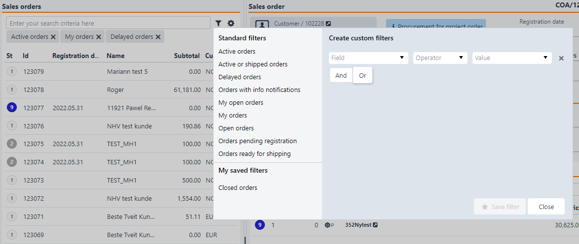
When you use a RamBase grid together with RamBase APIs, you get a lot of functionality "for free". As this example illustrates you'll automatically get autocomplete on all possible fields to filter by. The API also provides pre-defined filters in the filter dropdown.
Tip
You can also create your own custom filters in combination with the standard filters. These will be listed under "My saved filters"
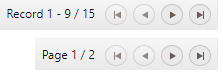
Navigation area
Navigation will help you to navigate to pages. Go to next, previous, first and last item.
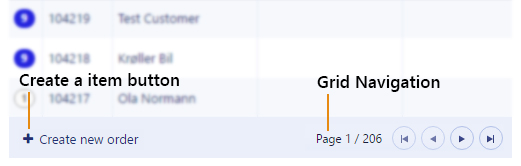
It is possible to show either pages or records:
Other
Other functionality the grid provides by default are:
Each user can choose which columns to show/hide
Export grid items to PDF or Excel
Keyboard navigation