Dropdown field
UI element for presenting regular dropdowns
Development guideline
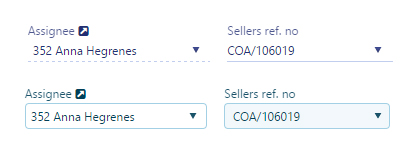
Example of two typical dropdown fields:
<rb-input type="dropdown"
          rb-fieldname="item"
          label="{{'Item' | translate}}"
          model="vm.selectedItem"
          k-data-source="vm.items"
          value="id"
          text="name"
          description="vm.selectedItem">
</rb-input>

<rb-input type="dropdown"
          rb-fieldname="Shippingday"
          label="{{'Shipping day' | translate}}"
          model="vm.salesOrder.shipment.shippingDay"
          apiresource="system/domain-values/applicable-values?object=CUSDOC&field=SHIPDAY&$top=200"
          data-k-on-change="vm.shippingDaySelected()">
</rb-input>
Attributes
apiresource : Address to the API where valuelist should be retrieved from. Can use binding. Ex. apiresource="{{vm.resource}}"
k-data-source: Array of values
text : Display value from the array
value: Key value from the array
description: Initial value. Needs to be initialized in the viewmodel.
k-on-change: Event triggered when value change.
k-scope-field: Variable to assign dropdown widget instance. Ex: k-scope-field="vm.dropdownInstance"
label: Label to show above the fields. Ex. "{{'Quantity' | translate}}"
ng-model: The value of the element. AngularJS takes care of two-way binding between the HTML view and javascript model.
ng-disabled: Makes the field disabled
ng-blur: Event triggered when blurring (leaving) the field
no-validate: Do not apply metadata to the field. Default "false"
metadata-model: Apply metadata from another field. Example 1: "vm.model.customerId". Exampel 2: "{{vm.metadatamodel}}". If you use a binding like this you must remember to set an initial value for vm.metadatamodel in the controller.
class: CSS class to apply to the whole UI element (label and field)
cssclass: CSS class to apply to the only the field (and not the label)
rb-inspect: Add inspect link next to label. When clicking the link, the users will be redirected to the provided value.
rb-focus: Set focus to the input field when given value evaluates to true
rb-fieldname: Makes the element customizable in edit mode (reorder and hide/show fields). This value will be the name of the fieldname in edit mode.
readonly: Makes the field readonly (Not overriden by metadata)
fieldsize: If no flex parent is present, use with bootstrap grid system (12/12)
labelsize: If no flex parent is present, use with bootstrap grid system (12/12)
custom-validate : Evaluate expression and returns a validation message. Ex. "vm.validate" where vm.validate is a function which returns a string value that is displayed as a tooltip if the validation fails.
access-doc: Defines which document to use for the access-rule-, or api-operation-attributes. Ex. access-doc="COA/{orderId}"
access-rule: Access rule (ARU) for enabling/disabling the button. Ex. access-rule="100143"
api-operation: API operation (AOP) for enabling/disabling the button. Ex. api-operation="100144"
operation-url: API url to use as base for the API operation request. Ex. operation-url="sales/orders/{orderId}"
access-display-state: The value "hidden" if element should be hidden instead of disabled when no access.