Complex dropdown
UI element for presenting complex dropdown
Development guideline
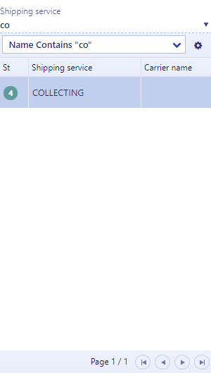
Example of a typical complex dropdown
<script type="text/ng-template" id="productTemplate">
                <div rb-grid
                     k-data-source="vm.dataSource"
                     k-on-change="vm.itemSelected(kendoEvent);hidePopover()"
                     default-filter="ProductName"
                     style="width:450px;height:400px"
                     k-columns='[
                    {
                        "field":"status",
                        "title":"St"|translate,
                        "width":40
                    },
                    {
                        "field":"product.name",
                        "title":"Product name"|translate
                    }]'>
    </div>
</script>

<div rb-fieldname="product">
                <label class="control-label">{{'Product' | translate}}</label>
                <rb-complex-dropdown ng-model="vm.product.name"
                                     metadata-model="vm.product.productId"
                                     attr-placement="bottom|left"
                                     attr-template="productTemplate"
                                     attr-placeholder="{{'Product lookup' | translate}}"
                                     attr-focus="vm.setFocus"
                                     attr-onkeydown="vm.keydown"
                                     attr-disabled="vm.isDisabled">
    </rb-complex-dropdown>
</div>
The script template can contain any markup, but typically this will be a rb-grid. The grid properties are described under the section Component Ui Elements - Grid.hidePopover() is used for closing the popover programatically.
Attributes
attr-component: Name of the component that will be displayed inside the popover. Se seperate section about complex dropdowns with component.
attr-params: The parameters that will be send to the component. Se seperate section about complex dropdowns with component.
ng-model: The value that will be displayed in the input field
metadata-model: Specify this if you need to get metadata from another field than the ng-model field
attr-placement: Specifies the popover placement (bottom/top | left/right). This will be overridden by the framework if the popover overflows the window size
attr-template: Reference to the script template which will be displayed inside the popover
attr-placeholder: Placeholder in the input field
attr-focus: Sets focus in the input field when the vm.setFocus value is true
attr-onkeydown: Event triggered from keypress in the input field
attr-disabled: Disable the input field
Complex dropdown with component
It is also possible to re-use the lookupcomponent for a complex dropdown.
// In view
<div rb-fieldname="product" class="flexitem full-width">
    <label class="control-label">{{'Product' | translate}}</label>
    <rb-complex-dropdown ng-model="vm.salesOrderItem.product.name"
                            attr-component="productLookup"
                            attr-params="vm.params">
    </rb-complex-dropdown>
</div>

// In viewmodel
vm.params = {
    vm.params.objectType = "SalesOrder"; // in parameter
    vm.params.productSelected = function (selectedProduct, priceUrl) { // out parameter (callback function)

    }
};