Checkbox field
UI element for presenting checkbox
Development guideline
Example of a typical checkbox field:
<rb-input type="checkbox"
    ng-model="vm.model.windowSeat"
    label="{{'Prefer Window Seat?' | translate}}"
    rb-fieldname="windowSeat">
</rb-input>
Attributes
ng-change: Event triggered when value change. Ex: ng-change="vm.toggleValue()"
ng-checked: The value "true" sets the checked attribute of a checkbox
label: Label to show above the fields. Ex. "{{'Quantity' | translate}}"
ng-model: The value of the element. AngularJS takes care of two-way binding between the HTML view and javascript model.
ng-disabled: Makes the field disabled
ng-blur: Event triggered when blurring (leaving) the field
no-validate: Do not apply metadata to the field. Default "false"
metadata-model: Apply metadata from another field. Example 1: "vm.model.customerId". Exampel 2: "{{vm.metadatamodel}}". If you use a binding like this you must remember to set an initial value for vm.metadatamodel in the controller.
class: CSS class to apply to the whole UI element (label and field)
rb-inspect: Add inspect link next to label. When clicking the link, the users will be redirected to the provided value.
rb-focus: Set focus to the input field when given value evaluates to true
rb-fieldname: Makes the element customizable in edit mode (reorder and hide/show fields). This value will be the name of the fieldname in edit mode.
readonly: Makes the field readonly (Not overriden by metadata)
fieldsize: If no flex parent is present, use with bootstrap grid system (12/12)
labelsize: If no flex parent is present, use with bootstrap grid system (12/12)
custom-validate : Evaluate expression and returns a validation message. Ex. "vm.validate" where vm.validate is a function which returns a string value that is displayed as a tooltip if the validation fails.
access-doc: Defines which document to use for the access-rule-, or api-operation-attributes. Ex. access-doc="COA/{orderId}"
access-rule: Access rule (ARU) for enabling/disabling the button. Ex. access-rule="100143"
api-operation: API operation (AOP) for enabling/disabling the button. Ex. api-operation="100144"
operation-url: API url to use as base for the API operation request. Ex. operation-url="sales/orders/{orderId}"
access-display-state: The value "hidden" if element should be hidden instead of disabled when no access.
Design guideline
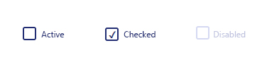
Checkboxes should be used when there are lists of options and the user may select any number of choices, including zero, one, or several. In other words, each checkbox is independent of all other checkboxes in the list, so checking one box doesn't uncheck the others. If there are more than four choices, consider using several columns.
Tip
A stand-alone checkbox (or a switch) is used for a single option that the user can turn on or off.