Button
UI element for presenting buttons

Development guideline
Example of a typical button:
<button class="k-button">OK</button>
Attributes
|
Button with icon

<button class="k-button"
    ng-click="vm.click()"><i class="icon-ok"></i>Create
</button>
Button group
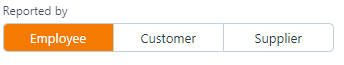
Circle buttons


Design guideline
Buttons are meant to direct the users into taking the actions required/needed. It is important that button design and the experience of using them are recognizable and offer clarity throughout the solution.
A button that initiates an action should be furthest to the right. The dismissive action of a dialog is always on the left. Dismissive actions return to the user to the previous state. All buttons must be available through use of keyboard only and the tabbing sequence must be following a mix of logic and on-screen order with primary action highlighted and in focus.
Visual
Note
To make the distinction between two options clear, a different visual weight for buttons is used. The button with the strongest visual weight will get the more attention.
Primary action button
This is to be used for the primary to the user`s task. The main buttons shall be used in functionality related to search, popups, creating processes and other high frequent actions. The primary action button should always be used for primary actions. When a primary action is enabled (e.g. after all required fields are correctly filled out) it should be available from using the enter-key.
When the primary action is positive (Send, submit, create): The primary action associated with a form needs to carry a stronger visual weight. Secondary actions should have the weakest visual weight, because reducing the visual prominence of secondary actions minimizes the risk for potential errors and further directs people toward a successful outcome.
When a Primary Action is Negative (‘Replace’ or ‘Delete’ ): The secondary action button should have a stronger visual weight. In this case, giving the button which stands for irreversible action more visual weight is dangerous. The user can choose the irreversible action as a safe option and proceed it by mistake. For example, when it comes to replacing a file, the speed of a task processing isn’t important. What’s really important is choosing the proper action so that users don’t regret their decision.
Irreversible actions like ‘Delete’ and ‘Erase’ operations usually require additional attention. A single and obvious confirmation action can be provided, without the disrupting concern for accessibility, cultural bias and decision confusion which can come from splitting the options by color alone.
Critical operations should be designed with a fundamentally different mechanism. As oppose to a regular action button that can be pressed by accident, a text field should be provided, and request to type e.g. "delete" to confirm the operation.
Secondary action button
Note
Secondary action buttons should be used mainly for functionality related to actions like close, cancel, regret etc.
Delete button
Delete button should be presented accordingly as red or similar. This should be used for destructive actions like delete, remove etc. The rule of thumb is to follow this with a confirmation step (Are you sure you want to delete? Yes/No), but for high frequent delete-usage, this will not be appropriate.
Label
A good and distinct label is important in order to make each option as clear as possible. It is preferred to name a button to explain what it does rather than just "OK" or similar. Never use "Yes" or "OK" if you can use a verb instead.
Tip
Example: A popup with the text "Discard draft?". Do NOT use the labels "No" and "Yes", but use "Cancel" and "Discard". There should be a descriptive tool-tip/label for all buttons. All enabled button functionality should be available from using keyboard only.