RamBase App Editor
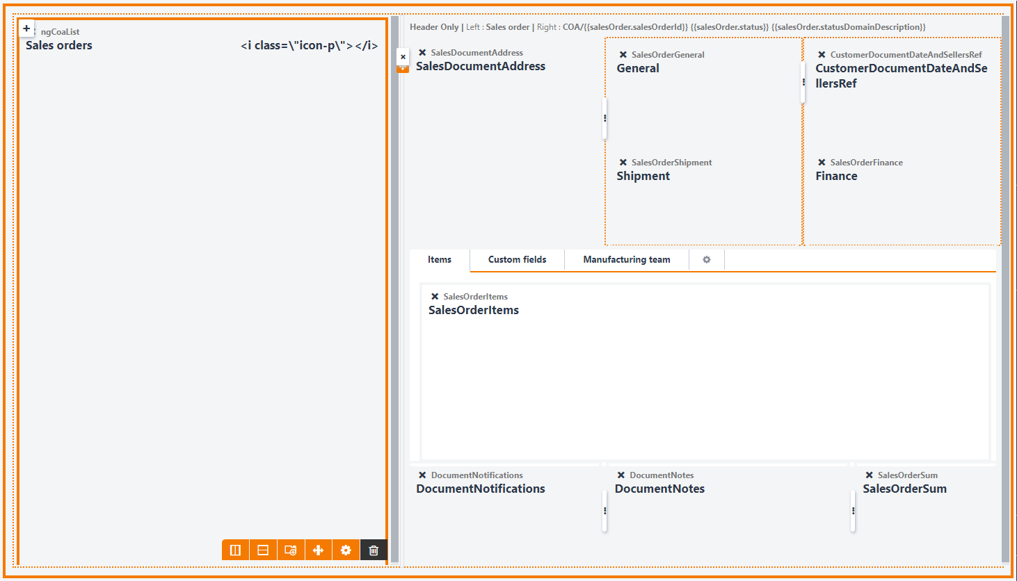
The RamBase App Editor is used to create and maintain applications. The most important part is to add components, and decide the size and where to place them. You also have headers, splitters, tab items, overlay and more. Define the placement and size of the components.
Application settings
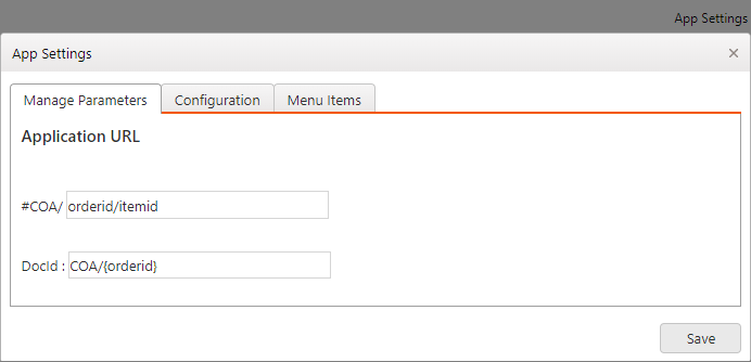
Manage parameters
The first input field is where you specify the application url parameters. It is a list of slash separated parameters. Components using url parameters needs to be mapped to the correct application parameter.
In this example we have an application which has defined two url parameters: orderid and itemid. Later we might want to add a component to this application: ngcoalist. This component has used another name for the orderid parameter, namely: salesOrderId. When we add the component to the application we then need to map the parameter salesOrderId to orderid. This is done from the component settings panel.
The second input field is not used in all applications, but here you can specify name of the main RamBase archive the application is targeting. This is needed for displaying file manager information and task information for the current document.
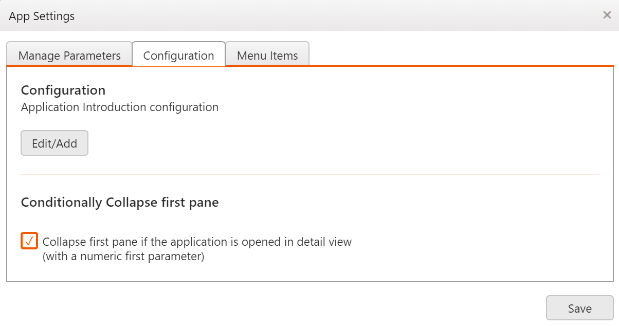
Configuration
Application tour: Clicking the Edit/add button will open a popup window where you can create an application tour which will be displayed to the user the first time they enter the application. The application tour will be shown as a set of speech bubbles, where each bubble can be attached to an HTML element. The tour is written in javascript using a collection of steps. Each step represents a bubble with properties like target element, intro text and position:
steps: [
    {
        intro: "Welcome to the sales order application!",
        position: 'right'
    },
    {
        element: $('[data-component-appmatch="ngCoaList"]')[0],
        intro: "Here you will find a list of all orders...",
        position: 'right'
    }
    ]
Collapse pane: Several applications in RamBase display a list view in a left pane (column) and a detail view in a right pane. Then if the application is opened with a numeric first parameter, it often means that the user is interested in the details of that particular item. Then by initially collapsing the left pane, the whole screen width will be dedicated to the detail view.
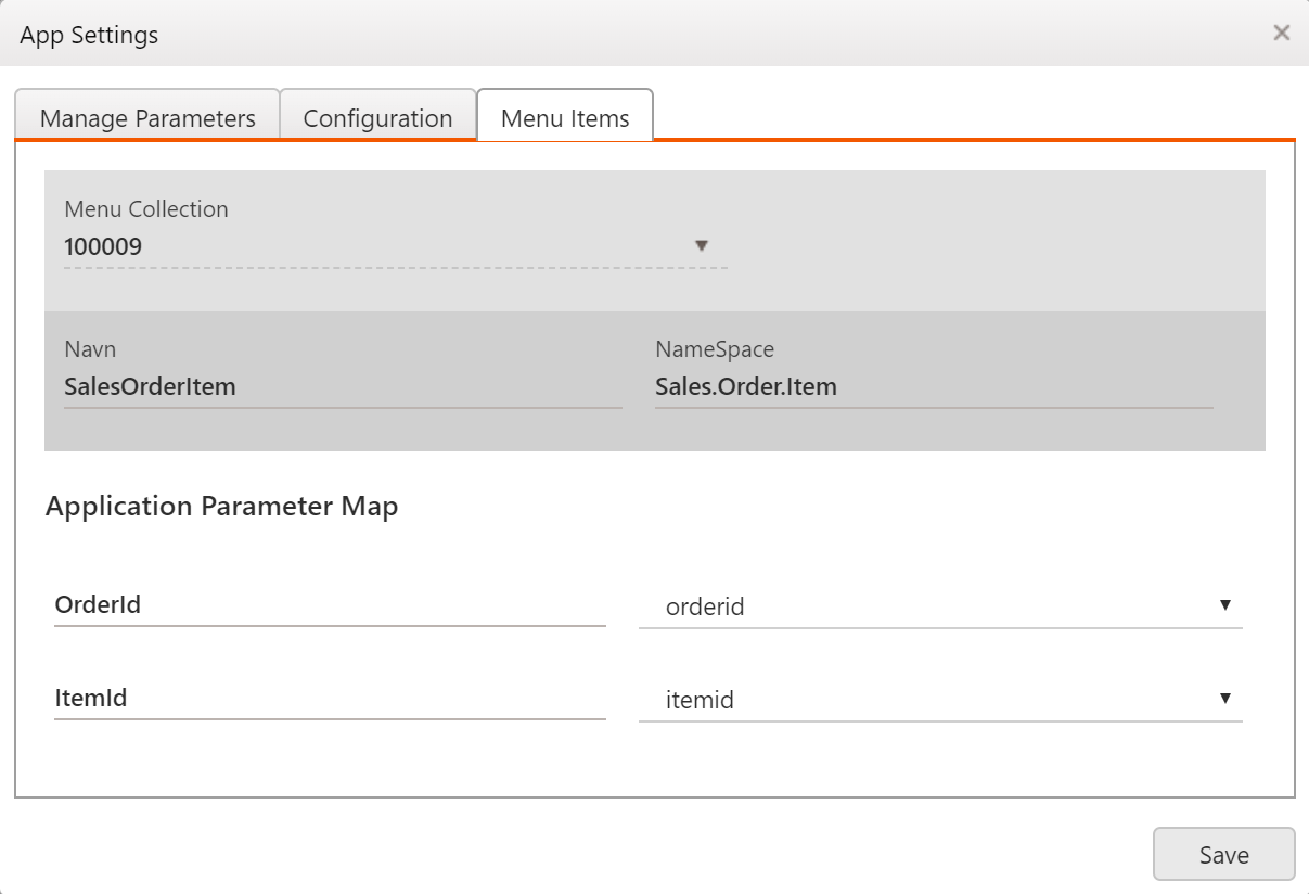
Menu items
Here you can select a collection of menu items you want to display in your application. The menu collection and menu items can be created in the CMC application. In this example we have selected the menu collection named: salesOrderItem. Many menu items like depends on parameters, and you would then need to map the parameters between the menu collection and the application.
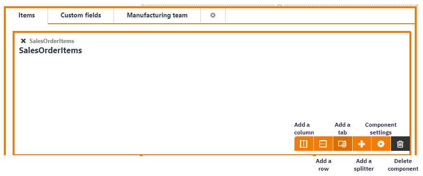
Component settings
The right side panel in app editor shows the different settings available for a component. You can activate the settings panel by clicking on a component cell in app editor, or by clicking the gear icon from the component toolbar.
|
|
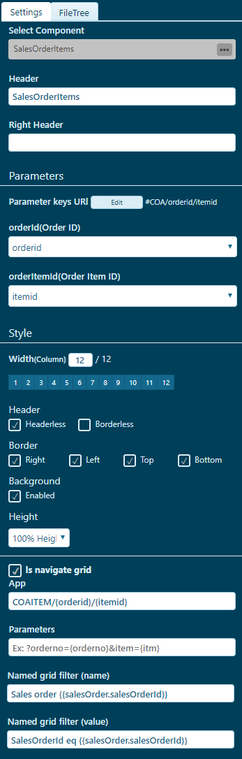
Parameters
When you add a component to the app editor, all component parameters will be listed as select boxes. The label is the parameter name defined in the component, and the dropdown items are the application parameters. You need to select (map) the component parameter to the correct application parameter. Like in this example the application will understand that it is the orderid parameter the component is addressing when the component wants to change the orderItemId value. The edit button is just a shortcut to open the application parameter definition under app-settings.
In a component there is also the possibility to specify static values. This is defined as acceptedValues in the components config file:
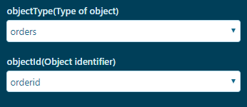
parameters: {
	objectType: { description: "Type of object", acceptedvalues:[ "orders", "quotes"] },
	objectId : { description: "Object identifier" }
}
Accepted-values will also be displayed as a select box, but instead of mapping it to an application parameter you need to pick the correct static value for the application.
HTML elements and translations in component header
It is possible to add HTML-elements inside the components header (or right header). Example:
<span translate>Translate this:</span><span> </span>
<span translate prefer-navigate-back=#COA/{{salesOrder.salesOrderId}}>
Navigate
</span> Example of using ng-show in the headers:
<span translate ng-show=app.applicationFields.salesOrder.customer.sales.salesAssistant.firstName>
    hi there: {{salesOrder.customer.sales.salesAssistant.firstName}}
</span>
FileTree
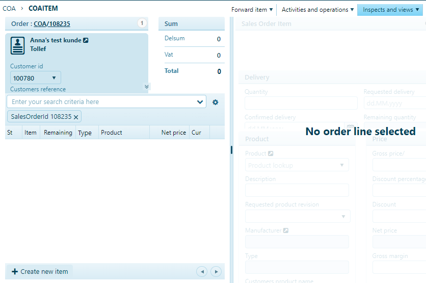
The Filetree in app editor is mainly used to add overlay text on elements like rows and panes.
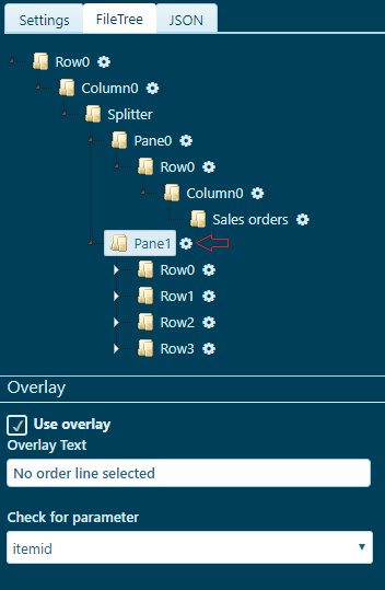
In this example the overlay text is added to to the second pane in the application when the itemid parameter is missing.
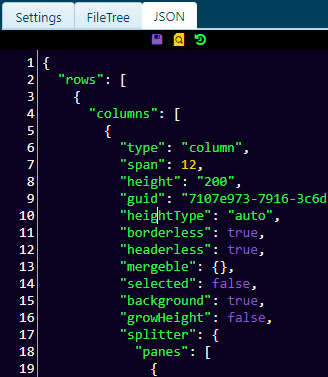
JSON editor
The JSON editor lets you inspect and edit the JSON structure of the application.
Tip
You can press the F11 key when focus is inside the editor to open the editor in fullscreen mode.
The three icons in the top are for saving, preview and reset of the layout. NB: You can only reset to the previous saved layout.