Component layout
We are using flexbox to create components layout, aims at providing a more efficient way to layout, align and distribute space among items in a container, even when their size is unknown and/or dynamic. This input fields are mobile friendly. Still if you need some customization we have made that also easy to do with some extra classes and open to use style.
Input fields are set min-width 150px and maximum with of 350px, this size are designed after testing in many devices and applications. But still you can customize the components as you wish you will learn that in below explanation.
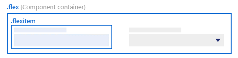
Regular use of flexbox
As shown below always have the “flex” class for container of the component along with "rb-input-form” and if your using "<rb-input>" flex relational classes will apply automatically.
<div class="rb-input-form flex">
       <rb-input>

       </rb-input>
</div>
Input field with icon
There are occasions input fields will carry an action/ information icon next to input field such situation you can use this "customflex" to place icon next to input
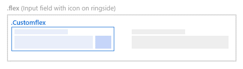
<div class="customflex">
 	<rb-input class="flexElementCont"></rb-input>
    <div class="flexElementIcon">
        <i class="icon-plus"></i>
    </div>
</div>
Custom size of element
Even though we defined min and max width of a input field area still you have option to customize input fields using some CSS attributes. Follow below example
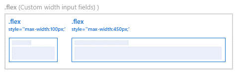
<div class=”flex”>
<rb-input style=”max-width:100px;”></rb-input>
<rb-input style=”max-width:450px;”></rb-input>
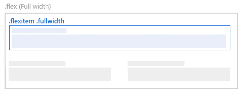
</div>Full width elements
If you need to have the input field to be fill the container you can use "fullwidth" class with along with other as shown below