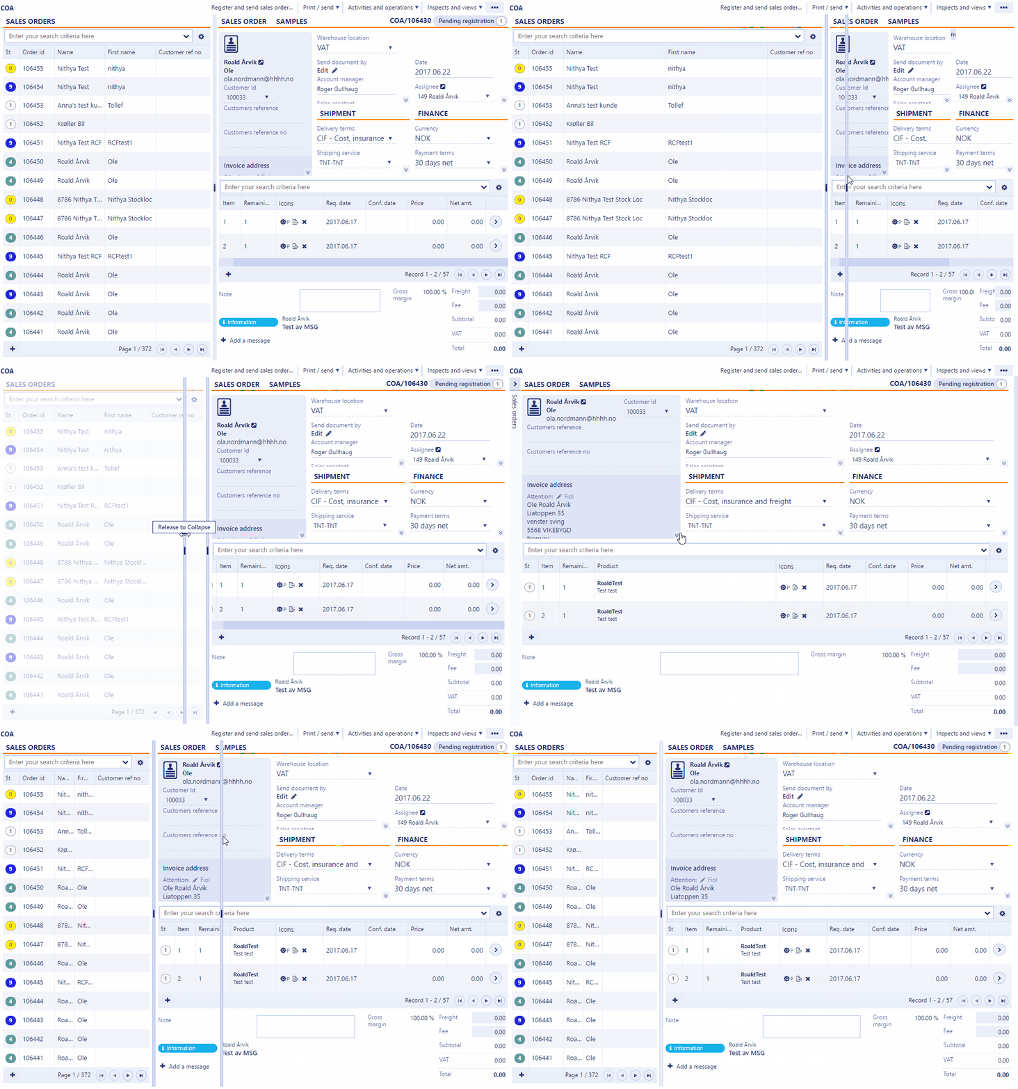
Splitter
The Splitter is specially designed to give users more freedom to customize the space within the application. A user can easily drag and adjust the content space. Settings will be remembered locally for future use. When dragging the splitter to the left so that less than 400px is visible in the left section, the section will collapse on release. It can be expanded again by clicking the expand icon.
Note
It is not recommended to have more than 2 sections (columns) within a splitter.
